Drupal.org lists over a thousand free Drupal themes. A few of these Drupal themes are the best on the planet. But many may be more trouble than they're worth. A few could wreck your site.
Here's a key question: how many sites are already using this theme? The more, the better.
With a Drupal theme, I'm not comfortable unless a couple thousand sites are already using it. And this standard disqualifies most free Drupal themes.
Two thousand is an arbitrary number. Many themes with fewer installs are probably fine. Some with more may have problems. Balance this standard against the other issues below, which focus on the developers' competence. In particular, if these developers have led other big projects, you can probably trust their obscure themes.
However, what if the developer is somewhat unknown, and you're not confident in your own ability to review PHP code for security and stability problems? In that case, a big user base is important before you try their theme on your live site.
· 1 Choose how many columns you need. Do you want to have two sidebar menus, only one sidebar menu or no sidebar menus at all? Drupal themes come in two columns, three columns and some that can alternate between two and three columns.
· 2 Choose a color scheme. Many Drupal themes only come in one color scheme, and the colors cannot be changed. Other themes come with color variations.
· 3 Check that the theme you are choosing is compatible with the version of Drupal you are running.
· 4 Consider functionality. Some themes do not have many configuration choices. Other themes have customization available.
· 5 Review the number or regions available. Besides columns, some themes also have customizable regions. The more regions, the more choices you have where to put blocks of content. Drupal themes with many regions are more complicated to use than simple two-column themes or three-column themes, but allow for more functionality.
· 6 Consider future plans for your website. When choosing a theme, think not only of the functionality of your website right now, but where you see your website in one year or two years. Although you can change themes easily, you are better off choosing a more flexible theme ahead of time than having to change the theme as your website grows.
There have been quite a few recent mobile statistics finding that mobile website design will build up mobile website usage -- some by as much as 28%! This is pretty amazing considering just how long mobile has really been around. Here at ThemeSnap.com we've been building a number of fully responsive, mobile Drupal themes for our users to choose from. We're continuing to build more and more Drupal mobile themes each month. But below I'll highlight some of the current mobile themes we have available for Drupal right now!
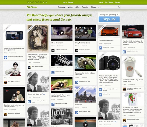
PinBoard Theme (Pinterest Clone)
The PinBoard theme is a Pinterest clone we built using the popular Drupal CMS. We have made many fixes, updates, and enhancements since just a little over a month ago. This theme is built using the very popular Skeleton responsive framework that makes it responsive on iPhone, iPad, and Android devices. We are about ready for our official out-of-beta release within the coming week!
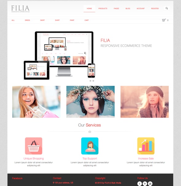
Filia - Responsive Drupal Commerce Theme
Filia is a responsive Drupal Commerce theme built using Twitter Bootstrap. This theme is fully responsive and includes a modern Commerce store design. Features of Filia includes filtered products sorting, modern hover effects, and retina display. Filia comes with Mega Slider worth $20 in itself. Filia is also SEO-ready and comes with full documentation to get you up and running quickly. With over 300+ icons and Google fonts ready, it's no wonder Filia is a #1 selling theme for Drupal Commerce.
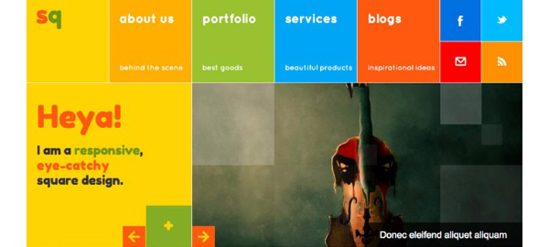
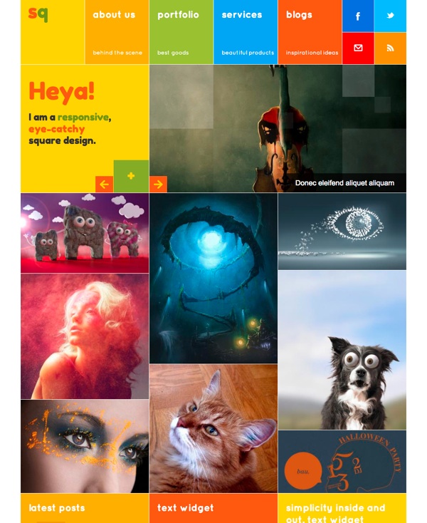
SQ: Square Metro Theme
SQ: Square Metro is a responsive Drupal theme designed for digital agencies or to showcase your designs or portfolio. SQ: Square Metro is clean and easy to edit or add content to -- providing easy, one-click, updating for your content. Try our Square Metro for your next responsive design project.
0 comments
Leave a reply